
Anyone planning an event will be familiar with the situation: shortly before a meeting with management or an important stakeholder, the question “What’s the current situation?” – and then the search begins. How many guests have registered? How many cancellations have there been? How are the hotel bookings looking? What is the open balance?
This is exactly where dashboards come in. They are the cockpit of an event. Instead of having to click through lists, reports and individual evaluations, a good dashboard provides the answers immediately, clearly and always up to date. This is worth its weight in gold for event planners and their stakeholders, as an overview of the current state of affairs is created in seconds instead of with tedious research.
A dashboard consists of individual components, known as widgets. Each widget answers a specific question: a key figure, a comparison, a grouping. Putting the right widgets together creates a picture that tells the entire status of an event.
From the standard dashboard to your own board
Until now, the standard dashboards in colada.guests have done their job reliably. However, the requirements of our users have evolved. Every event and every organization is different – so the desire grew not only to use ready-made views, but also to be able to build their own widgets and dashboards that exactly match the respective event.
We took this request as an opportunity to completely rethink the dashboard in colada.guests. The result: in addition to the tried-and-tested standard board and standard widgets, you can now create your own boards and widgets – flexible, individual and tailored to exactly the data that is important for the respective event.
And the best thing about it: you don’t have to start from scratch. The five most important widget types are available right from the start. This gives you a complete overview immediately and you can build on it at any time.
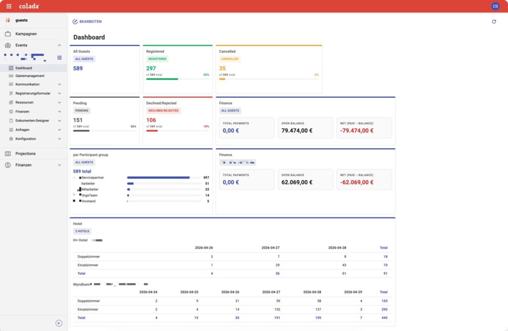
The five widget types at a glance
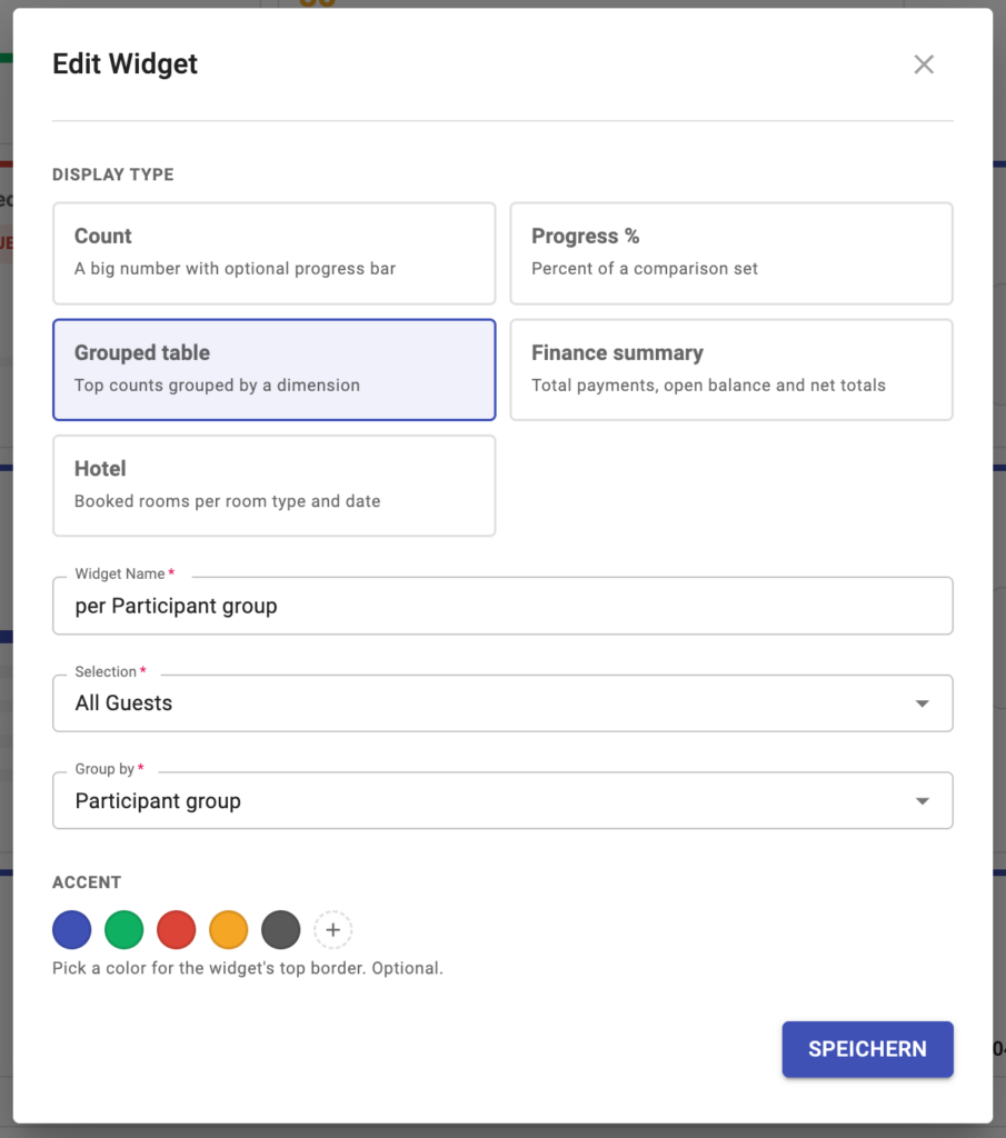
In the “Edit Widget” editing dialog, you select which widget type it should be. Each type is made for a specific type of information:
1 Count – the big number
The count widget is the classic counter function: a large, easy-to-read number, optionally supplemented by a progress bar that visually underlines the number. Perfect for key figures such as “All guests”, “Registered” or “Canceled”. On the dashboard, you can immediately see that 297 of 589 guests are already registered – including the bar that clearly shows the 50%.
2 Progress % – data in comparison
The Progress widget is used to compare data. It shows the percentage of a comparative quantity – for example, the number of registrations compared to the number of invitations sent out. This makes it clear at a glance how far you are on the way to your goal.
3 Grouped table – Count groupings
The Grouped-table widget summarizes top values according to a dimension. Ideal for counting participant groups or resources. In the example “per Participant group”, you can immediately see the distribution across all 589 guests: service partners (497), employees (51 and 22 respectively), OrgaTeam (14) and Management Board (5) – neatly grouped and highlighted with bars.
4 Finance summary – the financial data
The finance widget gets to the heart of the economic side of the event: total payments, open balance and net totals at a glance. Whether ticket sales, hotel sales or travel group sales – you can immediately see where the finances stand, including total payments, open balance and net (paid – balance).
5 Hotel – Rooms and occupancy at a glance
The hotel widget provides all evaluations relating to hotels, their room types and the occupancy rate per date. Booked rooms per room type and day are clearly displayed in a table – from double and single rooms to daily totals across several hotels. Anyone planning overnight stays has the complete booking picture at their fingertips.
Built on proven selection logic
One of the greatest strengths of the new dashboard is that it builds on the existing function for selections. This means that you can use the usual selections to define which data a widget should take into account – “All Guests”, a specific group of participants or a completely unique, complex logic.
This allows almost any type of analysis to be mapped. You are not limited to predefined filters, but can put together exactly the view that makes sense for the individual event. In the “Edit Widget” dialog, you simply select the appropriate selection and – in the case of the grouped-table widget – the dimension by which you want to group. It’s that easy to create a customized widget that is sure to make every planner happy.
Legible and individual: the accent colors
To ensure that a dashboard is not only informative but also pleasant to read, each widget can be color-customized. The accent color is used to determine the upper frame color of a widget – either from the predefined colors or your own. This allows you to visually group related widgets, highlight priorities or simply design a board that is easy to read for everyone involved.
The overview that grows with you
With the new dashboard in colada.guests , you get both: a ready-to-use overview and the complete freedom to develop it further individually. The five most important widget types – Count, Progress %, Grouped table, Finance summary and Hotel – are available right from the start. Based on the tried-and-tested selection logic, you can build on the basics and design your own boards that exactly match the individual event.
The result is exactly what event planners and stakeholders want: the most important event data at a glance – without lengthy research, always up-to-date and so flexible!